
How to Build a Color Story for Your Home
When people think about designing a home, they often focus on individual paint colors, furniture pieces, or finishes. But the homes that feel the most cohesive, intentional, and elevated usually have something deeper connecting every room: a color story.
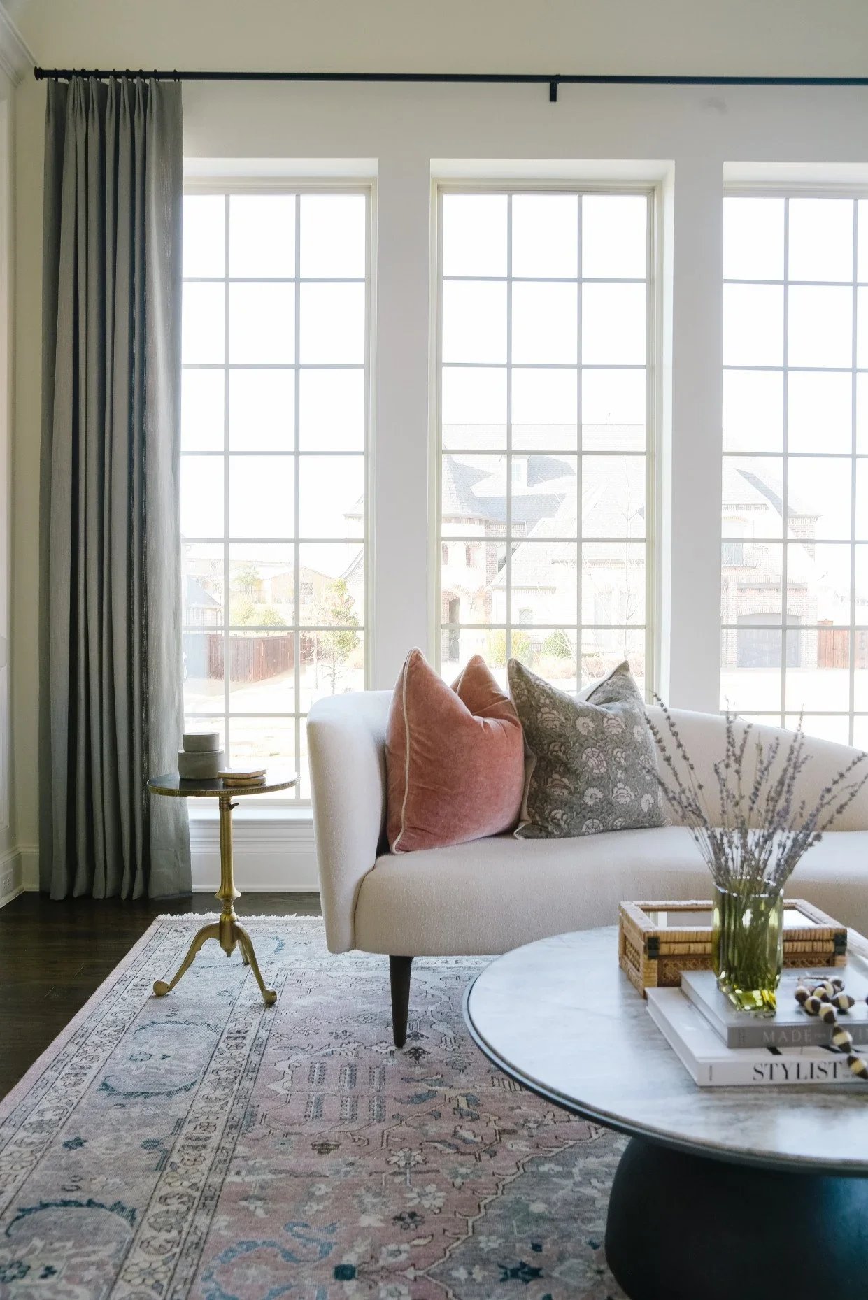
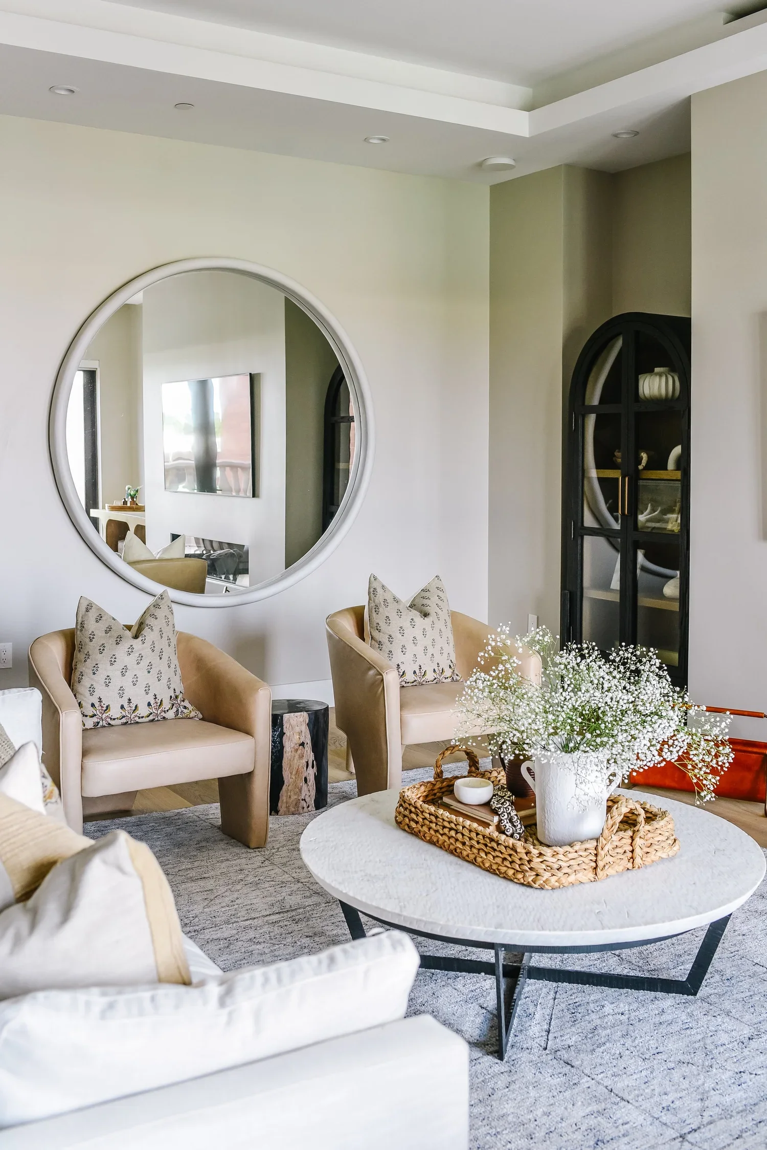
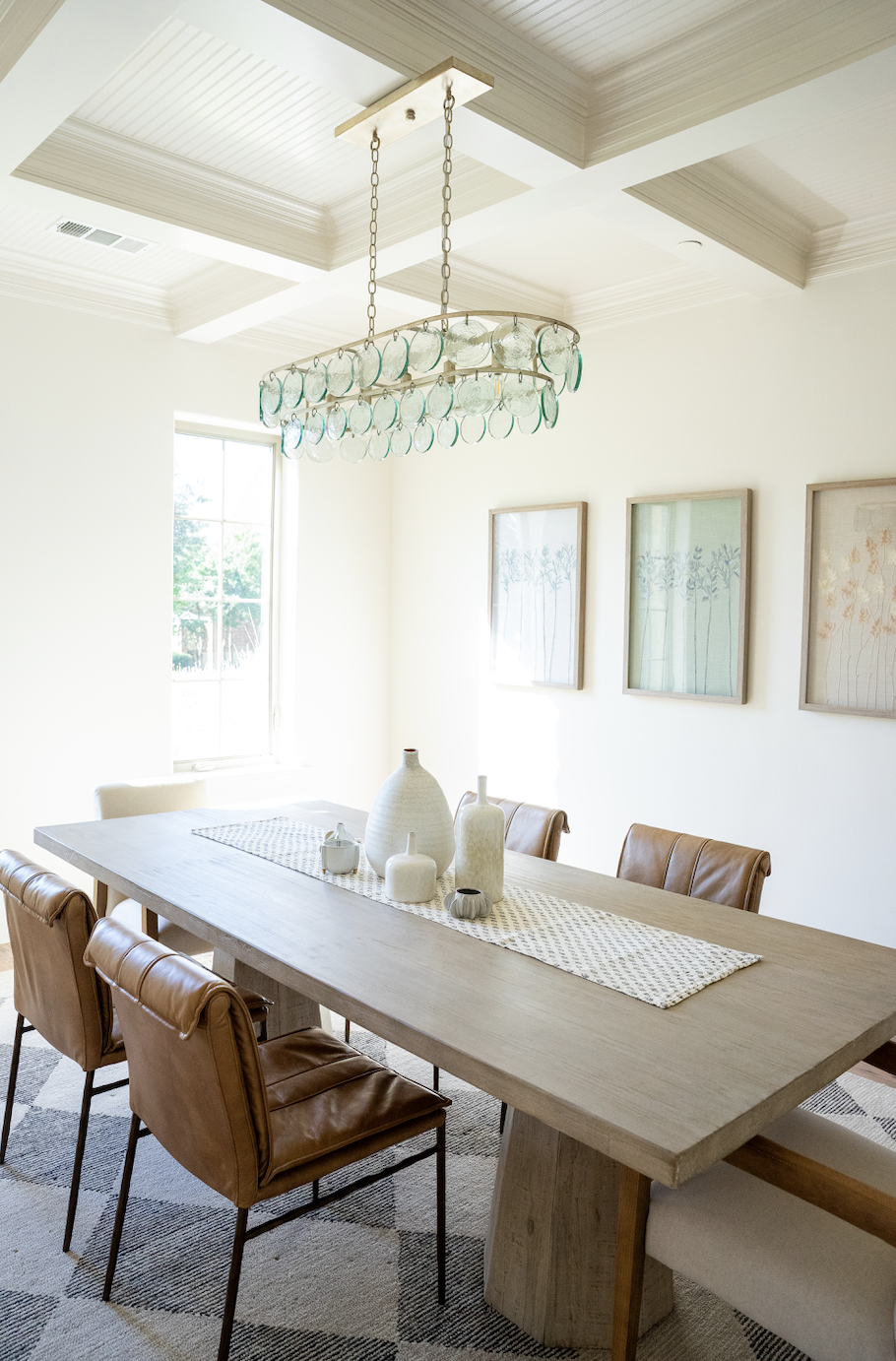
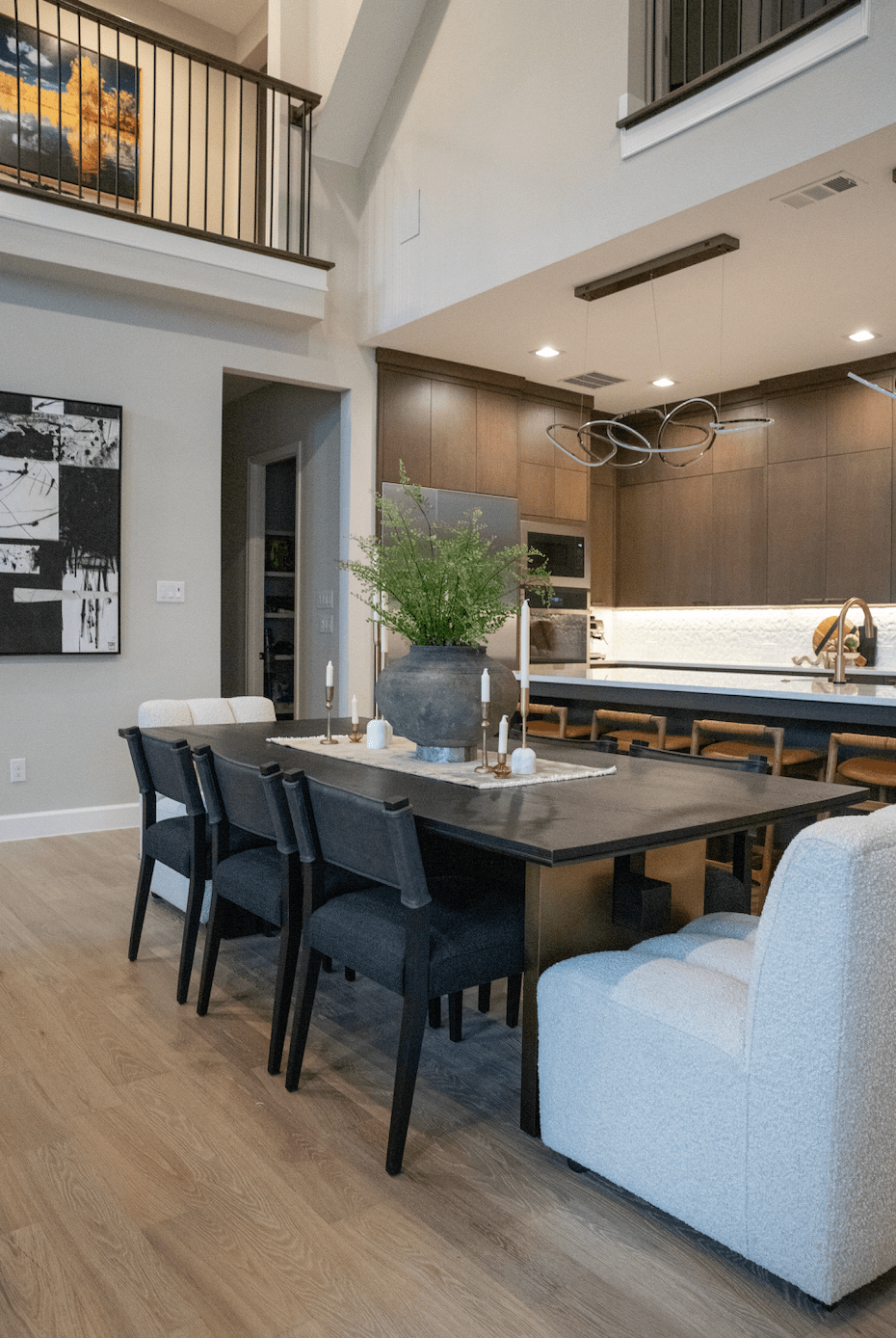
A color story isn’t about painting every room the same shade or matching everything perfectly. It’s about creating a thoughtful palette that flows throughout your home, allowing each space to have its own personality while still feeling connected to the whole.
At House Sprucing, one of the first things we consider when designing a home is how color will move from room to room. Here’s how you can create a color story that feels curated, timeless, and uniquely yours.
What Is a Color Story?
Think of a color story as the visual thread that ties your home together.
Just like a great novel has recurring themes, a well-designed home has recurring colors, tones, and materials that appear throughout the space. These elements create continuity and make your home feel intentional rather than disconnected.
Your color story may include:
Primary colors that appear throughout the home
Accent colors used strategically for interest
Wood tones and natural materials
Metals and finishes
Textiles and patterns
Artwork and decorative accessories
Together, these elements create a cohesive design narrative.
Start With Inspiration, Not Paint
One of the biggest mistakes homeowners make is choosing paint colors first.
Instead, begin with inspiration. This could be:
A favorite piece of artwork
A patterned rug
A fabric sample
A travel destination you love
A landscape that inspires you
A treasured heirloom
Often, the most successful color stories are rooted in something meaningful. Pull colors from that inspiration piece and use them as the foundation for your home’s palette.
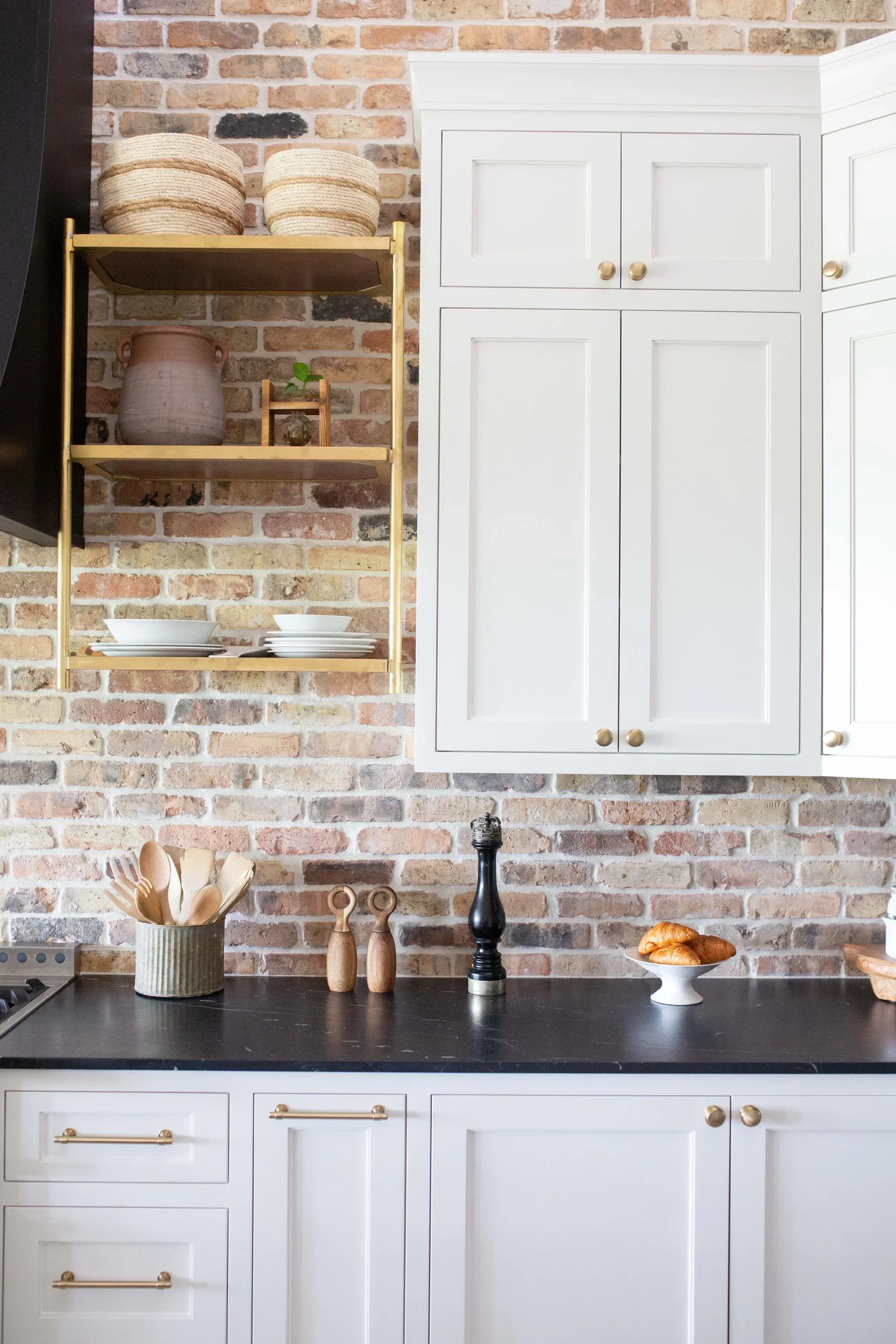
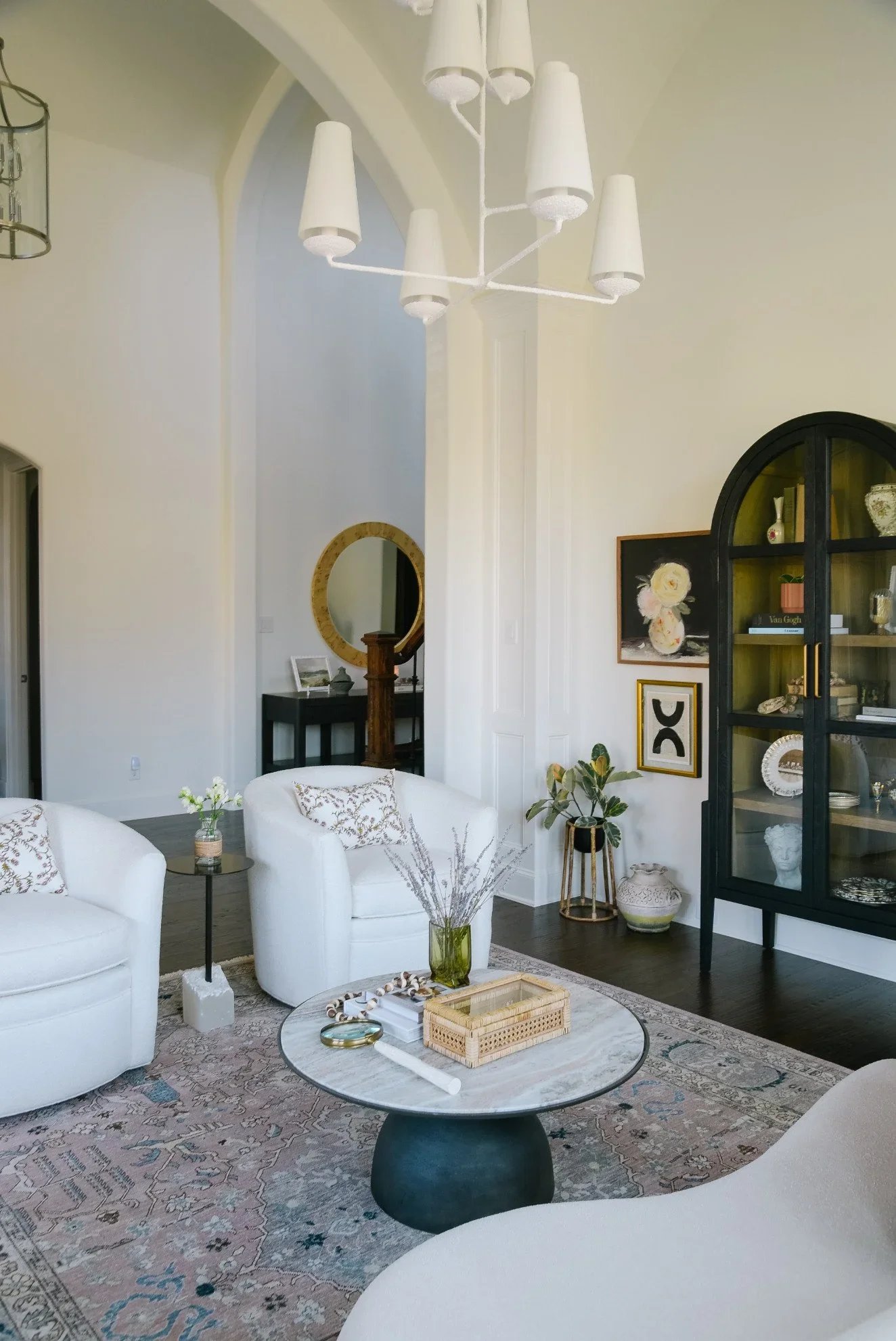
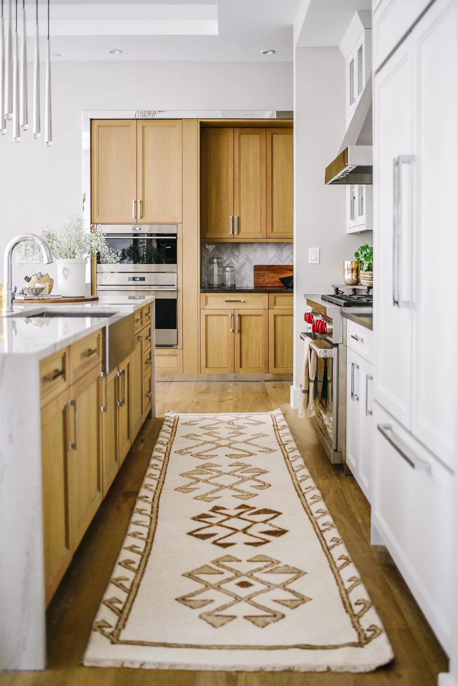
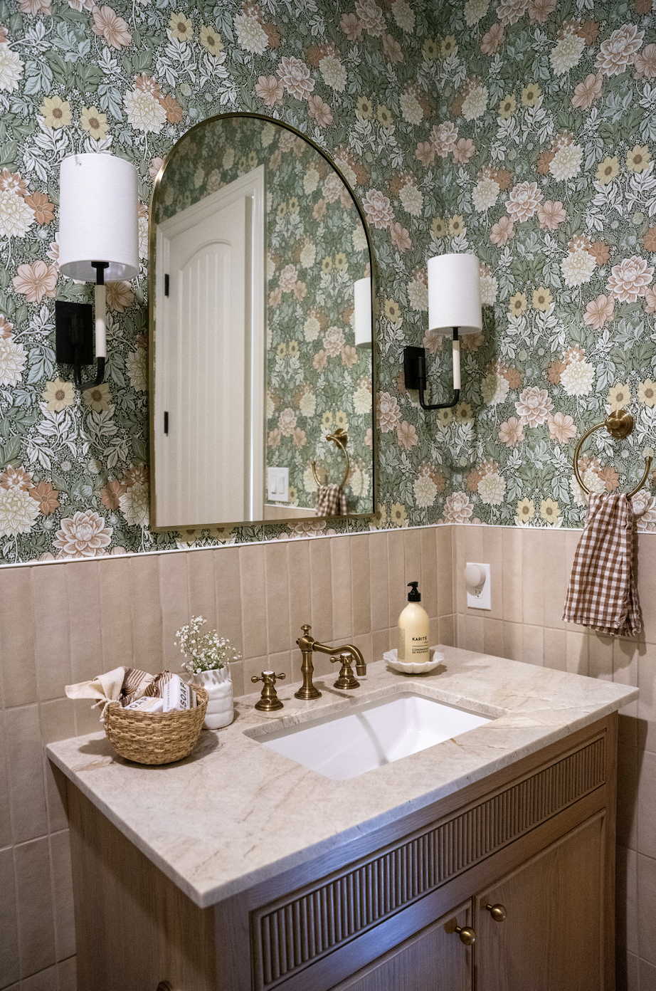
Choose a Core Palette
A strong color story typically includes three categories:
Neutrals
These are the foundation colors that appear most frequently throughout your home.
Examples include:
Warm whites
Soft greiges
Creams
Taupes
Charcoal tones
Natural wood finishes
Neutrals create flexibility and allow other colors to shine.
Supporting Colors
These colors appear repeatedly but in varying amounts.
For example:
Sage green
Dusty blue
Terracotta
Soft camel
Muted olive
Supporting colors help create rhythm as you move through the home.
Accent Colors
Accent colors add personality and energy.
Think:
Deep navy
Ochre
Burgundy
Forest green
Black
Use these sparingly through accessories, artwork, pillows, and decorative pieces.
Consider Sight Lines
One of the easiest ways to evaluate a color story is to stand in one room and look into the next.
Do the colors feel connected?
Open-concept homes especially benefit from a thoughtful color strategy because multiple spaces are often visible at once.
When adjoining rooms share complementary tones, the entire home feels larger, calmer, and more sophisticated.
The House Sprucing Approach
When we design a home, we think beyond individual rooms. We consider how colors, materials, and finishes work together from the moment you walk through the front door to the furthest corner of the home.
A thoughtful color story creates spaces that feel layered, collected, and effortlessly cohesive. More importantly, it helps your home feel like a reflection of you.
The best color stories aren’t built from trends. They’re built from the colors, textures, and experiences that make you feel most at home.
If you’re struggling to create a cohesive palette or are planning a renovation, House Sprucing can help you develop a custom color story that brings your entire home together beautifully. Send us an email at hello@hsdesignteam.com or text us at 214-471-0917.